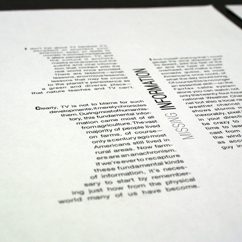
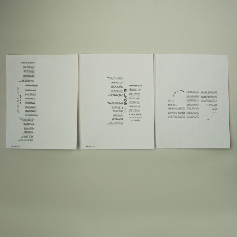
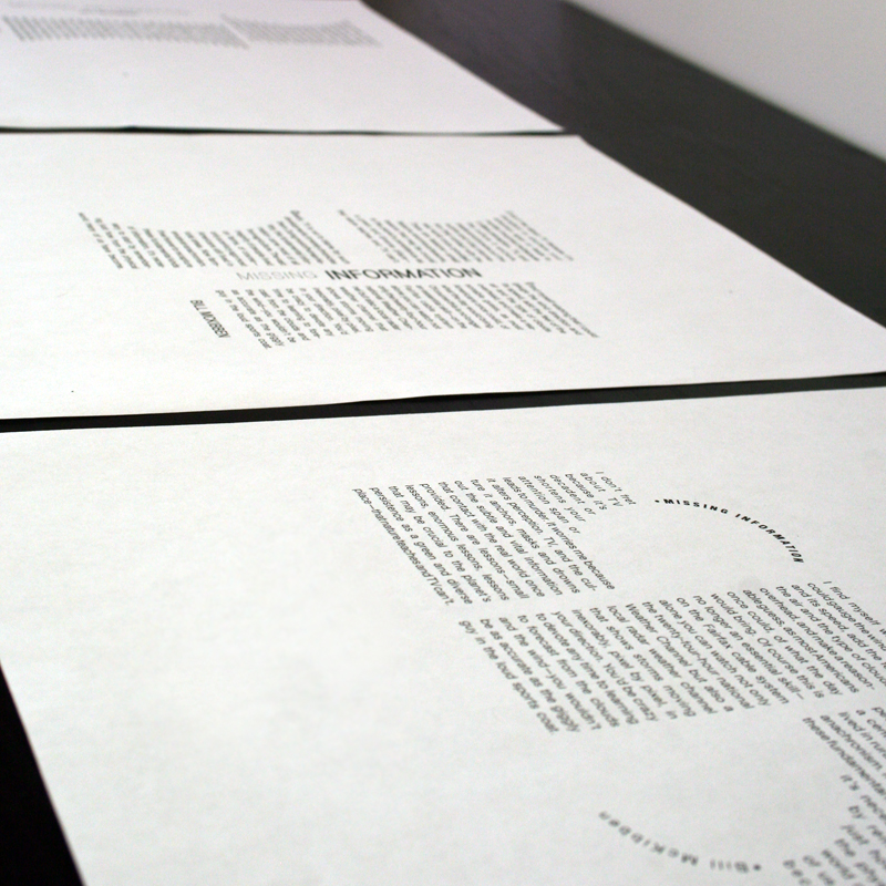
This is a small project in which I explored typographic relationships. The challenge was in creating an intriguing design that had subtle yet inviting qualities that would provoke a viewer to read the content.
After creating many variations with this content, some with a great deal of contrast, the most successful solutions are quite simple. There is not an overwhelming amount of contrast and variation, which limits distractions. This allows the content to flow nicely and makes it easy to read.